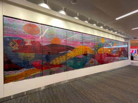
Hughen/Starkweather - Between Water and Land (installation view);
acrylic and gold leaf on glass and aluminum, 7 x 26 ft, 2019
Hughen/Starkweather’s ongoing project Shifting Shorelines
depicts and interprets the complex set of human and environmental factors that determine the ongoing history of shoreline areas. Artists Amanda Hughen and Jennifer Starkweather combine and distill a variety of visual and nonvisual data, including maps, photographs, topographies, interviews, and oral histories, into drawn, painted, and mixed-media imagery that mingles abstraction and representation to invite a fresh perspective on familiar landmarks and locations. The works in this series often combine passages of reticulated, washy “stains” made by wet or water-based media with areas of more hard-edged or linear marks, strategically summoning the idea of a shoreline landscape in the viewer’s mind.
Earlier this year, Hughen/Starkweather were selected via the SFMOMA to create a 7-foot-tall, 26-foot-long gold leaf and blue aluminum mural for the new Chase Center in San Francisco. Titled Between Water and Land
and created at Magnolia Editions with assistance from Lenehan Glass in Oakland, this piece continues the themes of Shifting Shorelines
, extending an abstracted gaze across the San Francisco Bay against a watery blue background.
The following conversation took place at Magnolia Editions on November 13, 2019 as Hughen/Starkweather began work on a large-scale commission for the Schwab corporate campus in Dallas, Texas. Writer Nick Stone spoke with the artists about the process of working at Magnolia to develop a site-specific work for the Chase Center lobby as well as their forthcoming Schwab commission, on which they continue to work closely with Magnolia Master Printer Tallulah Terryll.
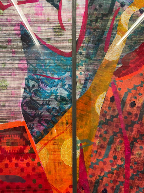
Hughen/Starkweather - Between Water and Land (detail view); photo by Tallulah Terryll
NS: Your Shifting Shorelines project often uses imagery where water is part of the media, so you have this interaction between wet and dry not just metaphorically or conceptually but literally in the piece itself. Did water play any part in the composition of Between Water and Land for the Chase Center?
AH: It does. The piece is three layers. In the back you can see these stains; then in the next layer, these are actual maps.
JS: Images based on the original maps of the area.
AH: Maps of San Francisco, Oakland, Berkeley. So these stains are on the aluminum, the back-most panel, which includes areas of raw aluminum.
JS: We created the stains on paper separately and then blended and merged them into that all-over background so there’s a variety of water marks that are visible there – less visible in this piece than in other pieces that we’ve done.
AH: So you can see this the San Francisco Bay peninsula, then Berkeley, and then going east, basically to Stockton. When we first were invited to do the piece, I think they approached us because we do site-specific work frequently: we do work about places, we gather information, we do interviews with specialists and community members, we look at maps and photos. Mainly our work is about collapsing the past, present, and future of a place and then creating an abstraction that somehow speaks to that. So this is one of the most map-like pieces we’ve ever done. And one of the reasons we wanted to do that was that it’s in the main lobby which faces the San Francisco Bay, it sits right on the edge of the city, south of downtown, and it looks east. And so it’s right on the edge of the water, which used to be marsh and is now very industrial.
JS: So you see Mount Diablo, and you can imagine what goes beyond that too. And it’s such a distinct horizon line out there. We were interested in capturing that landscape, looking beyond.
AH: What did this very industrial shoreline right in front of us – what did that once look like, and what might it look like again? Because a lot of our work is about sea level rise. Could these natural areas, as we need to kind of abandon some of this developed area in order to allow the water – give it a place to go – some of these marshes are being brought back. And even things like fire – that is actually bringing back some of the wilderness area. So we were thinking a lot about, as
Jennifer said, putting our arms around this larger Bay Area idea, of going all the way to Stockton. And also we knew that this [location within the Chase Center] was a long, skinny area, so it was kind of this perfect swath to go all the way to Stockton.
JS: And going back to your question about the use of wet media metaphorically and also as a subject or a concept, and less so in this piece, but I think the use of wet media also allows for lots of elements of chance to be brought into the work. That’s definitely an area that we don’t control; we definitely know more how to manipulate the wet media when we start, but it’s a way for us to bring in this surprise into the work, and sometimes it can create a structure or foundation for the work too.
It's like in addition to the two of you, the environment becomes another author of the piece, in a way.
AH: That’s a nice way to put it, definitely.
Hughen/Starkweather - Between Water and Land (detail view); photo by Tallulah Terryll
Can you tell me a little bit about the multiple layers you used in the fabrication of Between Water and Land and how you arrived at them?
JS: There’s three layers: a layer of aluminum, that
Amanda spoke about, and that’s where the blue stain is. And then there’s two layers of glass that sit on top of that. We went through a range of ideas in terms of materials, but one of the reasons we settled on glass was it allowed for a sense of depth and space in an area that we imagined, when we first went in there, was fairly dark. And from the artist’s renderings that we saw, we weren’t really sure how that would work. That’s also really important to all of our work: we build layers on top of each other and here we tried to mimic that same kind of process. So on the different layers, there’s the aluminum; then there’s gold leaf, the yellow that’s printed on one layer – it had to have its own layer of glass, because it’s special. And then on another layer of glass is where all the pink is printed. And everything else is knocked-out white. It was a complicated project, wasn’t it?
AH: Oh my God. It really was!
JS: As you try to explain it, you realize – I mean,
Amanda is the digital queen; just trying to wrap our head around what is printed, what is negative space, what is gold leaf –
AH: How do we break up the layers, what’s being scanned in... So the way it worked was, it was a commission from SFMOMA. And so we were working with SFMOMA and it was a very fast turnaround. We were notified of the commission in mid-April and it had to be done by mid-August. And that was basically a cold call. And so we very quickly developed ideas, some sketches, and they were interested in this idea. And then we started working with [Magnolia Editions] to figure out what is the best medium.
And we were concerned, as
Jennifer said – it’s basically in an alcove, in the lobby. So there’s no direct light on it. It’s all glass, the space, so there’s a lot of natural light, but as you know, glass is reflective. So what we came up with was this idea of a dark background, with the silver of the aluminum popping with the map and then the gold really popping these areas off of that. Because our work can be super subtle, and we were concerned, knowing the space, knowing the lighting situation, knowing we had to go with glass –
JS: And there’s a lot going on in that space: there’s this big LED chandelier, and this kind of wood-veneered escalator wrap that goes around – so there’s a lot of different materials that are happening in this space. So we needed to create a piece that really stood out in this funny little alcove.
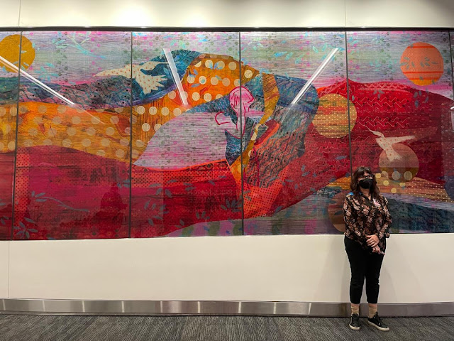
AH: So what we landed on was that the gold [represents] natural resources. So we basically did these drawings — this is sand dunes here, this is the Golden Gate Park Avenues/Richmond area of San Francisco, that was once all sand dunes. And so what we’ve done here is some of San Francisco – and this is true of the whole piece — are the actual city streets, but some of San Francisco and other parts of the map we’ve taken back to no development. These dots for us represent sand; so we’ve got these gold dots representing sand; we’ve got these topographies; marshlands, more sand. We were very deliberate and did a lot of research: what were these areas one point?
JS: And also looking at: how were sand dunes depicted in historical maps? What kind of symbols or marks did they use? And we referenced a lot of that.
Hughen/Starkweather - Between Water and Land (detail view); photo by Tallulah Terryll
AH: And again, this idea of compressing past, present, and future — so these are the airports: we put in the Oakland Airport and the San Francisco Airport. But then we just did them in dark blue. And people can kind of take what they want from that idea –
JS: Is it submerged? Or was it submerged?
Or will it be?
JS: Will it be, right.
AH: And so it was definitely a very ambitious project because the other thing we felt really strongly about was – thinking about the site, knowing all the people coming in from all over the Bay Area – again, Stockton is kind of this point of reference for us. We wanted people to be able to look at this map and say: there’s Stockton. And so we took the time to actually draw the streets of these towns, so people would be like: yup, there it is, and there’s Main Street. That was incredibly time-consuming as you can imagine. And that’s not something we’ve ever done before, to be that referential. But it felt important for this piece.
And then for the gold, as we said, it’s all these natural resources: mountain ranges; there’s a flock of birds somewhere; sand dunes, marshes, there’s some butterflies... and thinking of course about the symbolism of gold: the Golden State, this idea of the Gold Rush, the series of Gold Rushes that have hit the Bay Area – the tech Gold Rush, the [literal] Gold Rush. And thinking about natural resources now – with climate change and the incredible amount of development, and that possibly the most precious thing, the gold, you could say, of California is really becoming its natural resources. Because the resources dwindling and becoming more and more precious are really these wild areas, so that’s what we wanted to render in gold for this piece.
JS: And the pink lines, too – you know, ultimately we work very abstractly, even though we have references of a very depictive map in here. But for the pink lines, we wanted a reference to – it could be refracted light, the quality of light, it could be energy, a certain dynamism; so we wanted this other element in there to work with something that was more referential, like a map. And that’s where the pink lines came in. And there’s little references to topography in there. So it was more of an abstracted image that sat on top.
Hughen/Starkweather - Between Water and Land (detail view); photo by Tallulah Terryll
Tell me about Magnolia’s role in making Between Water and Land for the Chase Center and what it was like working here.
JS: Instrumental! I mean, we learned a lot from [Magnolia Editions Master Printer]
Tallulah [
Terryll], and this is the first time we’ve done anything at this scale and this complexity. And so they really guided us through this process a lot, everything from making the files to printing, giving us feedback about how to make the files, actually working on them... We’ll speak about
Tallulah because that’s who we’ve worked with: she’s got such a fine sensibility and such a keen eye and she’s astute.
AH: And the knowledge of materials: for us, we mostly work on paper, so it’s about translating that to something that’s so incredibly different and trying to get our heads around how to do that, what’s it going to look like.
JS: The scale of it is huge; that’s something that we could not even imagine. And they’re used to blowing things up and envisioning what this looks like at a larger scale. That’s where it just takes more practice to start to understand that. And that’s where we really leaned on them. And you know, it is truly one of my favorite things to come in here and just see what they’re doing. It’s such a lab and they’re constantly experimenting, and they are always trying to reinvent something. And I think that’s super special and unique. I did a lot of research on other printers in the country, primarily in California, for other projects, and really no one does what they do.
AH: And it’s a mixture of understanding the materials and being willing to experiment and do things that maybe really haven’t been done before, but also a true respect for the artist.
Tallulah would always come back to: well, what do you want? What is your vision of what this would look like? If we were tweaking little colors or a quality of line, that was a big thing. Because our work is so linear, so quality of line is really, really important to us. And
Tallulah knows that because she’s looked at our work. So it was great to have that, that felt really good.
The other thing for me that was so critical is that we have complete trust that they have the artist as the most important player in this game. Because large-scale commissions, there are so many people involved – you’ve got the fabricator, the client, the installer, the framer, the engineer, the architect – and it just always felt like Magnolia had our back. This was actually a very complicated project with many players, and it was great to know that this is going to be the best piece it can be because Magnolia’s doing it with us.
JS: I’m going to add one last thing which is: they come from a tradition of printmaking, too. And I think that those roots of hands-on making are kind of the foundation here.
Hughen/Starkweather - Between Water and Land (installation view);
acrylic and gold leaf on glass and aluminum, 7 x 26 ft, 2019
I guess it speaks to your enthusiasm for working with Magnolia that you’re continuing to do so for another project. Can you tell me a little bit about the commission for the corporate campus in Dallas, Texas?
AH: So that’s different — we’re really excited to work on wood for that piece. So that’s going to be 28 feet wide by 18 feet high; it’s going to be 16 wood panels to create that size. And it’s in the new
Schwab headquarters in Dallas, so it’s their largest headquarters outside of San Francisco. And they approached us, again with this idea of being interested in a site-specific work. So we went to Dallas: the site is off the beaten path, north of Fort Worth. We looked at the colors of the landscape, thought about the history of that landscape, the area – and what they wanted us to think about, too, was some kind of connection with San Francisco, which is why they invited a Bay Area artist to do this piece, I think. So we are creating an abstract, site-specific piece about that area...
JS: ...That
Tallulah will be printing in the next few weeks.
AH: The way that it was constructed is different. The one that we’re doing for Dallas on wood is all one layer. So it’s one piece that’s scanned; [
Between Water and Land] was more complicated because it actually had to be made up of different pieces to be scanned and then blown up. And then it was even more complicated because what we did was a gazillion tiny smaller drawings – so for example, we did a drawing of the tip of Marin; we did a drawing of Treasure Island; we did separate little drawings of the Presidio, of all of these marshes, and the airports; and each one of those was scanned in and then placed. So it was this crazy complicated digital file. So it was all handmade, but then [assembled] digitally.
Hughen/Starkweather - Between Water and Land (installation view);
acrylic and gold leaf on glass and aluminum, 7 x 26 ft, 2019
This is not specific to any one particular piece, but I was curious about your practice generally – one thing I read on your website and that I’m hearing now is that it’s informed by these visual and representational media like maps, but there’s also this component of interviewing people. I wondered: how does something that’s non-visual like that ultimately make its way into the artwork?
JS: It’s made its way in in a lot of different ways. In a more subtle way, it just informs us; and it broadens our understanding of our subject. We did a couple of projects around the construction of the new Bay Bridge a number of years ago, and we interviewed a lot of people for that project – from architects who were working on the bridge to Caltrans people, and that helped us understand the dimensionality of that project. In other pieces, we’ve taken actual excerpts and integrated them into the work; they become audio pieces that accompany the work; so we’ve played around with a lot of different ways where language or text can be a part of the actual piece.
AH: And our process is, as we said, about gathering information, and we talk a lot about how we are not specialists by any means in any of these places or topics that we make work about; we are very much learning and following this meandering trail of information. And that really interests us. And then this idea, for example, with the work we’re doing with climate change, thinking about: there’s so much data, so much information, a lot of it can be overwhelming; so how can our work kind of tap into this information in a way that goes beyond words or beyond data and allows the viewer to have a different kind of response to what’s going on? So it’s almost like we’re giving people space to think about a place or a topic in a different way than something like a newspaper article or a book or an interview would. So I feel like the interviews come into that process in a way that’s really unique, where sometimes we will directly solicit: can you talk about that place in visual terms? Can you tell us about it in descriptive terms? And then we will definitely think about those words when we’re making the work.
So it’s almost like they’re mapping it for you, but using language, instead of something more visual.
AH: Yes. And then, as
Jennifer referred to, we’ve actually recently started to use text in the work itself, and so currently we’re working on a project that we’ll be showing in Miami in December where we’ve interviewed several people in Miami about the flooding that they are experiencing on a regular basis. We’ve been working on this project for almost exactly a year now. And we are interested in Miami because it’s a place in the United States that’s already experiencing flooding on a regular basis in a way that other coastal cities in the United States might experience soon. So we’ve been interviewing people from all over Miami, different backgrounds, different places in Miami about flooding, and we’re actually using some of that text in some of the pieces we’re creating. And it’s these text excerpts that are kind of abstracted. So there are words that can be made out, but it’s almost to give the viewer an idea of someone’s voice: there’s a voice here, there’s a person behind this.

for the Union Square/Market Street Station of San Francisco’s Central Subway.
Photo by Paul Chinn, The Chronicle
Hughen/Starkweather - artists' website
More public artworks created at Magnolia Editions


