Wednesday, August 15, 2012

Chuck Close: Problems & Process

Close in his New York studio, April 2012. Photo by Donald Farnsworth.

What if an observer familiar with Chuck Close's entire output as an artist – more than 40 years of work, hundreds of images, thousands of hours – were asked to sum it all up in a single word? Most likely, after discarding the obvious but superficial choices – portraiture, say, or the erudite-sounding but largely inaccurate Photorealism – one would inevitably arrive at the word process. Whether in reference to his unique paintings or his editioned prints in a staggering array of media (woodcut, etching, aquatint, daguerreotype, tapestry, silkscreen, and handmade paper, to name only a few), the common thread to Close's work – and the key to understanding its significance – is the artist’s rigorous emphasis on process.

Chuck Close - Phil/Watercolor, 1977.
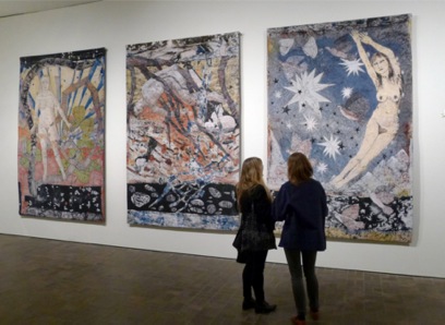
Watercolor on paper, 58 x 40 in. (image courtesy Pace Gallery)

After all, to take a brutally cynical tack – how else could a bespectacled, bald fellow create pictures of his own face for nearly fifty years and remain relevant and influential? How else could Close get away with revisiting his 1969 painting of Philip Glass over and over again, as an etching, an inky fingerprint mosaic, as an intimate watercolor on paper and in several unique renderings made of raw paper pulp? In a tongue-in-cheek nod to his own obsession with repetition, Close himself gave a 2003 touring exhibition of his digital prints, tapestries and daguerreotypes the wryly understated and banal title "A Couple of Ways of Doing Something." And yet, rather than having been written off as a "one-note" artist and fading into obscurity, Close has been celebrated and even lionized by the art world. For decades – after the initially unfavorable reviews that are often a bellwether for art that is worth paying attention to – his work has received critical accolades from the likes of Robert Storr, Terrie Sultan, and Richard Shiff. He has even become something of a trendsetter (e.g., the recent art world fawning over Craigie Horsfeld's 2010 grisaille tapestries, which Horsfeld himself has admitted were inspired by the black-and-white tapestry portraits Close has been creating since 2003). How, the cynic might wonder, is this possible?

Chuck Close - Phil State II, 2006. Jacquard tapestry, 103 x 79 in. Edition of 6.

The answer lies in Close’s unflagging commitment – to borrow the title of yet another exhibition, a 2003 retrospective of his editions seen at the Metropolitan Museum of Art and several other museums around the country – to "Process and Collaboration." Close has kept his career in perpetual motion by making process his raison d'etre; it is the defining characteristic of his work and the reason why so many artists, even those whose work looks nothing like his own, cite him as an inspiration or influence. Yes, Close recycles images; but each painting and each edition serves as a unique record of its own construction, offering a meta-commentary on the very convention of representation itself. Close's work subjects both the creative act of generating an image and the critical act of visually perceiving that image to equal scrutiny. His paintings, prints and multiples serve as a two-way mirror, reflecting both the decisions of the artist to make marks and the decisions of the viewer to make meaning from those marks. As such, those artistic decisions, moreso than the subject, emerge as the focus of each work. Another name for this creative decision-making, the crux of Close's art and the reason for its impact, is process.

A distinction worth making at this point is the difference between process and formula. In the catalogue for "Process and Collaboration," Close describes himself as "an artist looking for trouble," adding: "Problem solving is greatly overvalued in our society. Problem creation is much more interesting." Close is not and has never been looking for a solution, a formulaic, predictable approach to image-making where he is able to get the "right answer" every time. To reduce his work to a formula – as, for example, a digital artist recently attempted with the so-called "Chuck Close Filter" algorithm – would be to miss the entire point of Close's artistic enterprise.

Chuck Close - Roy II, 1994. Oil on canvas, 102 x 84 in.(Smithsonian Institution)

For example, Close's painting style since the mid-1970s – those grids of concentric, abstract rings and blobs of color which Storr calls "tiny optical jitterbugging Mondrians" and which ultimately, against the eye's expectations, somehow coalesce into a realistic, representational portrait of a human face – has become something of a trademark and might easily be mistaken for a formula. And in fact, there is a technique behind it which is consistent from painting to painting – Close lays down a color in each square, then responds to it with another color, then responds to that combination with another. Paradoxically, this systematic approach acts as a set of rules designed to introduce the unpredictable and to challenge the artist’s decision-making capacity at every turn:

I want to mix it up. Ultimately it allows me to be intuitive. The system is liberating in that when I used to allow myself to make paintings with any old color, I would use the same color combinations over and over again. I found myself much too much a creature of habit. One of the interesting things about working this way is what seems to be a kind of rigorously imposed system that might seem limiting or perhaps stifling in terms of the choices you can make. But it ends up allowing me to let my mind go blank and respond. (Chuck Close: Storr, Varnedoe, et al. 2002)

Detail from Roy II, 1994. Photo by Ellen Page Wilson, courtesy Pace Gallery.

Close's painting method, then, uses a self-imposed series of limitations to repeatedly open up a space of improvisation. It is a predictable procedure, but one whose goal is to access the unforeseen: those ephemeral moments of strange alchemy where one color becomes another, where blobs of blue and orange and purple pigment suddenly turn into Philip Glass's chin, where accident and intention unite to push the work one step closer toward the impossible – toward the very edge, the periphery of what a given medium is thought capable of. This alchemy is different depending on the medium, but it is known to artist working in all mediums. The history of each medium is the story of creative minds building on each other’s innovations (and in some cases, making identical breakthroughs at the same time without realizing it) to access this unfamiliar, improvisatory space, in which discoveries are made which inadvertently redefine the limits of that medium.

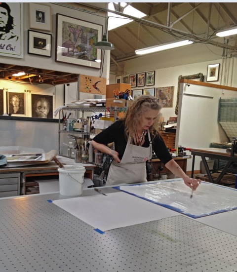
Close himself is well aware of this collaborative aspect of innovation – hence "Process and Collaboration," rather than simply "Process." There have been a handful of key collaborators – in particular, Joe Wilfer of Dieu Donné in New York; David Adamson of Adamson Editions in D.C.; and Donald Farnsworth of Magnolia Editions in Oakland – who have been central to Close’s exploration of various print and multiple mediums beyond painting.

Chuck Close - Self-Portrait/Pulp, 2001. Stenciled handmade paper pulp in 11 grays, 57.5 x 40 in. Edition of 35. Dieu Donné Papermill, New York, and Pace Editions Ink, New York (image courtesy Pace Editions).

Often their contributions have begun with a challenge: like anyone, Close has his own prejudices for or against certain ways of working, and only at the urging of one of the forementioned collaborators has he begun to explore a medium he might previously have dismissed. Sultan writes that Wilfer "encouraged, teased and pestered" a reluctant Close into working with pulp paper; the portraits which the latter eventually created at Dieu Donné set a new standard for artists working in that medium. In a 1997 interview with Storr, Close spoke of computers disdainfully as "labor-saving devices" in a quote that has been unfortunately divorced from its context and circulated in an effort to depict Close as an old-fashioned Luddite. Yet Adamson was already working to change Close's mind: in 1996, a time when "digital" was still a pejorative in the art world and a full year prior to Close's comments, Adamson Editions published his first digital editions, two Iris prints of Bill Clinton. In the last decade, Close has repeatedly taken advantage of the extraordinary detail, control, and image size afforded by Adamson's digital printers and Magnolia Editions' tapestry translation techniques, using contemporary technology to transform the intimacy of daguerreotype plates and Polaroids into powerfully haptic, large-scale confrontations. More recently, Close has worked with Farnsworth to create editions of archival watercolor prints: the surface of each digitally composed print bears the kind of unique, painterly visual information (reticulation, granulation, bleeding, and chance movement) that is the exact opposite of algorithmic certainty. Ultimately, each partnership bears witness to Close's devotion to process as challenge, rather than as solution – even when that challenge is being posed to the artist's own ideas about the relative limits of a given medium.

Close's earliest digital edition, Untitled (President Clinton) Frontal, a 1995 Iris print created with Adamson Editions (image courtesy Post Fine Art).

The nonlinear nature of Close's choice of media may provide the strongest evidence of his commitment to process. The artist is always circling back, revisiting techniques and visual methods; in his career, writes biographer Christopher Finch, "cross fertilization has been the chosen method of propagation, with each technical approach informing every other." The photorealistic aspect of his large-scale photographs of the early 1980s finds an echo in the staggeringly detailed tapestries and prints of the last 15 years. And while his recent watercolor prints have direct antecedents in the systematic, color-separated watercolors Close began creating in the 1970s, the allover, continuous nature of these recent compositions blurs figure and ground and distorts pictorial legibility in a manner reminiscent of his particularly loose, abstracted oil portraits from the mid-1990s. Close has repeatedly returned to etching and paper pulp, among other mediums; at any given point in time, he is creating images using very different methods with highly varied degrees of abstraction, color, and tonality. This devotion to multiple ways of working again suggests that it is the process itself which is paramount. No one medium is sufficient to solve the artistic problems Close has posed for himself, because he is not looking for a solution. And whether a given creative experiment succeeds or falls short, Close says, the outcome is always the same: "I get right back on the horse again."

Chuck Close - Mark Watercolor/Unfinished, 1978. Watercolor and graphite on paper, 53.5 x 40.5 in. (image courtesy Pace Editions)

In 1978, Close told an interviewer that by exploring images in series he was "not trying to figure out how many ways there are to skin a cat," but rather was interested in "seeing how subtle shifts in materials, devices, and attitudes can make drastic differences in how the image is perceived." In the decades since, the availability of sophisticated imaging technology has grown exponentially; in turn, Close's "subtle shifts" are increasingly relevant to how we apprehend and assess an image. Works of art built from grids of tesserae have existed for approximately as long as humans have organized themselves into nations; whether Close arrived at this mode before digital art, a question some have taken pains to pedantically answer in the negative, is moot. In Close's newest work, the series of watercolor prints created at Magnolia Editions, one sees evidence of a more nuanced relationship to mark-making and digital technologies.

Close's 2012 watercolor print of Cindy Sherman (not yet editioned).

Contemporary digital imaging is recognizable by the relentless ferocity of its realism: with each technological advance, image files contain additional millions of pixels, and prints are created from tinier and tinier picoliters of ink, in turn yielding greater degrees of detail. As informed viewers, this level of detail clues us to the image's composition. Even if the pixels are too small to see, we know that a mechanical process must have been involved in generating an image of such precise mimetic accuracy. In the case of Close's airbrush portraits of the 1970s, the expected machine was a camera; in the present day, we trust that software and digital printers are responsible for the wealth of detail before us. Then and now, Close's work delights in confounding our expectations. In Close's watercolor prints, this uniquely digital precision is conflated with the gauzy abstraction and tactile values of watercolor – that plebeian, Sunday painter's medium, an art-historical byword for Impressionistic lyricism. As the viewer's eye relaxes focus, the subject's face coalesces, rich with the color and tonality afforded by digital media; sharpening one's gaze, the surface of the prints dominates: an array of tiny, sensuous color field paintings, each square reading individually as a wet blur or puddle of pigment. Close has embedded the "subtle shifts in materials [and] devices" directly within the work, playfully disarming the received wisdom that poses an artificial distinction – whether historical or otherwise – between such seemingly disparate technologies as inkjet printing and watercolor.

Detail from Close's 2012 watercolor print of Cindy Sherman (not yet editioned).

This embedded tension, a series of visual and perceptual frissons between surface and figuration, digital and analog, pixels and pigment, beaux-arts tradition and 21st-century trailblazing, makes no conclusive statement; it is instead the record of an open-ended inquiry, one currently engaging a great number of Close's contemporaries. Writing about Christopher Wool in 2011, Mark Godfrey asks: "How does an artist show painting's involvement in technological networks of digital photography and printing – yet also engage the specific marks that only liquid materials can form when spilled and smeared, or when their pigments and binding mediums are allowed to separate?" That Close is not the only one exploring this Moebius loop of digital and analog processes reveals his role within a larger discourse of image-making, a discourse that is as crucial to his process as the pigment and substrates with which he works. Close's work is part of an ongoing conversation, the goal of which is not to arrive at some teleogical certainty; there is no "E=mc2" to which it all boils down. A formulaic approach to Close's work can only skim its surface; it is his creative, collaborative process which breathes life into the work, providing inspiration to contemporary imitators and – more crucially – to the artistic innovators of the future.

-Nick Stone


More art by Chuck Close at Magnolia Editions

Tuesday, August 14, 2012

New Hung Liu tapestry edition

Hung Liu - Above the Clouds, 2012. Jacquard tapestry, 57 x 76 in. Edition of 6.

Chinese history has always been the essence of Hung Liu’s work: raised in Beijing during Mao’s Great Leap Forward and trained in the Social Realist tradition, Liu now uses painting as a means to reanimate historical photographs. “I hope to wash the subject of its exotic ‘otherness,’” she writes, “and reveal it as a dignified, even mythic figure.” The subject of Liu’s recent tapestry edition Above the Clouds possesses a double layer of this perceived exoticism – he is Lu Zo, a young Tibetan from the borderlands of China, where minority nationalities practice a spiritual tradition long associated with mystery and rebellion. Liu’s tapestry combines Zo’s beatific countenance with symbols from traditional Chinese iconography and her own uniquely expressionistic brushwork to reflect on this tiny, enigmatic figure’s journey of reincarnation.

Liu found the source photograph of Lu Zo in Lamas, Princes, and Brigands, a compilation of pictures taken by National Geographic photographer Joseph Rock in the 1920s and 30s. The caption identifies Zo as “last son of the ruler of Yongning, declared by authorities in Lhasa to be the incarnation of a high lama of Drepung Monastery.” It is an arresting image; where Liu’s 2009 tapestry Little Lama depicted an exalted young lama crowned with an elaborate headdress, Zo looks rather like a poor monk in his bare head and simple robe. Yet compared to his brother and sister, Zo’s face has an uncannily worldly look, as if centuries of reincarnation have already endowed him, says Liu, with an old soul.

Joseph Rock’s 1926 photograph of lama incarnate Lu Zo (center) with his elder siblings. © Joseph Rock & China House Gallery.

Liu remarks that the Tibetan people and other outlying minorities have long held an exotic quality for the Chinese majority, likening their relationship to the limited Western understanding of Muslim peoples today. “Tibetans looked different, spoke a different language, and lived far away,” says Liu; “when the Dalai Lama escaped from China, he was treated by Han Chinese as a foreign invader.” The photograph, she explains, is from a world at a distance – geographically, culturally, linguistically, and across time. Zo’s physical body has long since passed away, but his status as a reincarnated lama and his curious, knowing expression suggest a spiritual longevity which transcends time and borders, a timelessness to which Above the Clouds pays a poetic tribute.

The tapestry’s palette is dominated by a faded, rusty red evocative of old bricks, the Chinese Imperial Garden walls and Tibetan robes; Liu calls it “a noble color,” one that suggests age and honor. The washes and drips of her original brushwork create an uneven, tumultuous surface; the shift to tapestry further complicates this surface by introducing the tension of vertical and horizontal threads, as if mirroring the complex layers of untold story and forgotten history that catalyze Liu’s practice. Zo is surrounded by lotus flowers, which are homonyms for “peace” in Chinese, and by a siege of hovering white cranes, which Liu reveals were inspired by a painting by a Song dynasty emperor famous for his calligraphy. The crane is an auspicious messenger from heaven in Chinese folklore but is practically unknown in Tibetan art: to combine the cranes with a Tibetan lama is “a cultural and religious collision,” says Liu, “but they look harmonious, as if they could remain that way forever.”

Press release for Above the Clouds (PDF, 346Kb)

More art by Hung Liu at Magnolia Editions

Thursday, August 9, 2012

Press Release: Kiki Smith tapestries

Kiki Smith - Earth, 2012. Jacquard tapestry, 113 x 75 in. Edition of 10

As an artist uniquely attuned to surface, and one whose practice revels in the possibilities of printmaking and multiples, it seems only natural that Kiki Smith has been working with Magnolia Editions since 2011 on a suite of three tapestry editions. The three tapestries – titled Sky, Earth, and Underground – were first exhibited in early 2012 at the Neuberger Museum of Art in Purchase, New York, as part of Smith’s exhibition, “Visionary Sugar.” Magnolia Editions’ tapestry technique is an ideal vehicle for Smith’s visions, yielding objects halfway between printmaking and sculpture, rooted in the Medieval yet informed by digital sophistication, and possessing a complex yet beguilingly tactile surface.

Kiki Smith - Sky, 2012. Jacquard tapestry, 113 x 75 in. Edition of 10

While her line and drawing style are unmistakable, Smith’s works in various sculptural and print media often employ sophisticated technologies in tandem with handwork. As Wendy Weitman writes in Kiki Smith: Prints, books & things, “Smith thrives on collaboration... Sculpture and printmaking share this collaborative attribute, each often requiring specialized artisans to achieve the finished object. Not surprisingly, Smith excels at both.” The artist is no stranger to textiles: she has been printing and painting on fabric since the early 1980s, including small editions of printed scarves. However, these tapestries employ no printing; their imagery is made up entirely of warp and weft threads. Each composition has undergone dozens of steps and versions on its way to completion, from large collaged paper drawings to digital files; prints to reprints to reprints with overpainting and more collaging; painting, weaving, and reweaving until each detail, texture, and color met exactly with the artist’s specifications.

Kiki Smith - Underground, 2012. Jacquard tapestry, 113 x 75 in. Edition of 10

From crisp pencil lines to watercolor washes and the wrinkles of Nepalese paper, Smith’s tapestry editions weave together a multitude of surface textures, at times conflating skin and bark, feathers and fur, air and water to depict a richly heterogeneous world teeming with life. The scale of the double-headed Jacquard loom allows for the depiction of life-sized human figures, surely appealing to an artist whose work has so often reenvisioned the human form. Earth’s female nude is covered with marks resembling the bark of a birch tree, perhaps recalling Daphne of Greek mythology, who famously metamorphized into a tree to thwart the amorous advances of Apollo. Placed atop a winding, serpentine branch, one hand resting on a snake and the other on a leaf endowed with eyes, Earth’s figure suggests a theme common to all three tapestries: an absence of boundaries between human, flora, and fauna native to the realm of myth and animistic spiritual traditions. Smith says the cast of plants, animals, and heavenly bodies in this body of work suggest “how imperative it is at this moment to celebrate and honor the wondrous and precarious nature of being here on earth.”

Download Press Release as PDF (904 KB)

View Kiki Smith tapestries at Magnolia Editions (with zoom feature)

Thursday, July 5, 2012

New Guy Diehl edition

Guy Diehl - Still Life with Yves Klein Blue, 2012
Etching with acrylic, 22 x 25 in. Edition of 18

Looking at the virtuosic precision on display in Guy Diehl’s latest print edition Still Life with Yves Klein Blue, one might never guess that the acrylic painting which served as its source was created amid personal turmoil. It’s one of my favorite paintings of the last decade, says Diehl: I was making a lot of changes in my life, and the painting somehow secured what I was doing: there was a conspiracy between my life and this image, but a good conspiracy. As if in response to this personal flux, the work’s composition suggests a powerful sense of harmony and intentionality: the movement from the complicated reflections and curves of the bottles on the left to the angular certainty of the postcard and gift box on the right echo the emerging personal resolve that Diehl experienced during its creation, as does the passage from dark to light as one’s eye passes across the print’s surface.

Diehl’s work typically takes as a point of departure his heroes and inspirations from art history – in this case, the French painter, sculptor, writer, performance artist and provocateur Yves Klein. Klein is perhaps best known for working with a chemist to develop his own patented color, International Klein Blue, which he used almost exclusively to create his monochromatic works in various media. Colors have a very specific effect on people, Diehl notes: decades ago, a painting instructor told me, ‘If your painting isn’t working, just put some red into it.’ To me, Klein’s is a seductive blue. This striking ultramarine pigment is on display in Diehl’s print in the form of a postcard reproduction of one of Klein’s monochromatic canvases; it also functions as an emotional cipher, connoting intensity and ‘the blues’ even as its warmth and saturation draws the viewer in.

Diehl’s great affection for his eponymous 2007 Klein Blue painting led him to revisit its composition in 2012 as an intaglio print at Magnolia Editions, where he digitally recomposed the colors and values of the image to fit the new medium. He also incorporated a lace-like pattern into the background, created by layering pencil strokes on mylar for hours to build up a unique, hand-drawn texture. The print was proofed and revised with printer Nicholas Price over the course of several months: a close look at the extraordinary blue reflections in each of its glass bottles reveals Diehl’s determination to capture the most subtle movements of light and color within each object. The final work fairly hums with a compressed unity, its shadowy palette briefly punctuated by vivid, almost sparkling highlights, as if celebrating the artist’s capacity to strive, even in dark times, for moments of brilliance.

Please contact the studio for pricing and availability of Still Life with Yves Klein Blue, or download the press release (PDF, 73k).

More work by Guy Diehl at Magnolia Editions

Tuesday, July 3, 2012

Norbert Prangenberg (1949 - 2012)

Portrait of Norbert Prangenberg by Phong Bui

Effervescent sculptor and painter Norbert Prangenberg passed away on June 29, 2012. A professor at the Art Academy in Munich, Prangenberg exhibited his lively, heavily impastoed oil paintings and faience-glazed ceramic sculptures widely in his native Germany. In recent years his international renown had begun to grow; his first solo exhibitions in Britain and the United States coincided with the release of A Child's Vi[r]gil, a collaborative artist's book with John Yau published by Magnolia Editions in 2010.

The staff at Magnolia Editions sends its condolences and best wishes to Prangenberg's family, friends, and students.

Please read a conversation between Yau and Prangenberg at the Brooklyn Rail, which discusses Prangenberg's unusual artistic development and his unique, thoughtful approach to composition.

John Yau and Norbert Prangenberg signing A Child's Vi[r]gil at Yau's home in New York City, 2010

Monday, March 12, 2012

Faisal Abdu'Allah at CAAM

Faisal Abdu'Allah, Donald Farnsworth, and Barbaro Martínez-Ruiz (foreground) with The Last Supper I, a 2010 tapestry by Abdu'Allah published by Magnolia Editions, at the Centro Atlántico de Arte Moderno (CAAM)

Magnolia Editions' own Donald and Era Farnsworth recently traveled to the Canary Islands to preview an exhibition by Faisal Abdu'Allah which included several works created at and published by Magnolia.

Era Farnsworth and Faisal Abdu'Allah at CAAM

The exhibition, a retrospective of Abdu'Allah's work entitled "The Art of Dislocation," can be seen at the Centro Atlántico de Arte Moderno (CAAM) in Gran Canaria until May 27, 2012.

Interior of CAAM with works by Faisal Abdu'Allah; all installation photos by Donald and Era Farnsworth

Installation view of Abdu'Allah's I Wanna Kill Sam 'Cause He Ain't My Motherfucking Uncle, a series of prints on aluminum panel created at and published by Magnolia Editions, at CAAM

The London-based artist was introduced to Magnolia by Barbaro Martínez-Ruiz and Enrique Chagoya, both professors at Stanford University's art department.

Abdu'Allah, whose work often uses cannily staged portraits to confront accepted notions of criminality and heroism, is also a lecturer at the University of East London and a visiting professor at both Stanford and the University of Wisconsin, Madison.

CAAM director Omar-Pascual Castillo with Abdu'Allah and two BBC journalists in front of Abdu'Allah's Adeve, a carbon black pigment print on long panels of backlit film, printed at Magnolia Editions


Abdu'Allah and Martínez-Ruiz reminisce with Castillo, who has known Martínez-Ruiz since their childhood days in Cuba

An early adopter of digital media, Abdu'Allah has spent several intensely prolific sessions at Magnolia, using the studio's high-tech tools and the expertise of Donald Farnsworth to translate images from photographic media (in some cases, low resolution images made with some of the earliest available versions of Adobe Photoshop) into blisteringly high-impact prints and tapestries.

Abdu'Allah outside of CAAM

Detail of banner above

Please contact Magnolia for pricing and availability of Abdu'Allah's editions, or visit Magnolia's website for more work from Faisal Abdu'Allah.

CAAM website

Wednesday, February 29, 2012

Kiki Smith tapestries at Neuberger Museum

Tapestries by Kiki Smith, published by Magnolia Editions, at Neuberger Museum; photo c/o Artnet

As an artist uniquely tuned in to surface, and one whose practice revels in the possibilities of printmaking and multiples, it should come as no surprise that Kiki Smith has been working with Donald Farnsworth of Magnolia Editions for the past year on a suite of three tapestry editions.

The three tapestries -- titled Sky, Earth, and Underground -- can currently be seen at the Neuberger Museum of Art in Purchase, New York, as part of Smith’s exhibition, "Visionary Sugar." More photos and information about the show are available here.

Kiki Smith creates a hand-painted texture at Magnolia Editions

Smith is no stranger to textiles: she has been printing and painting on fabric since the early 1980s, including small editions of printed scarves. While her line and drawing style are unmistakable, Smith's works in various sculptural and print media often employ sophisticated technologies in tandem with handwork. As Wendy Weitman writes in Kiki Smith: Prints, books & things, "Smith thrives on collaboration... Sculpture and printmaking share this collaborative attribute, each often requiring specialized artisans to achieve the finished object. Not surprisingly, Smith excels at both."

Ingredients of a Kiki Smith tapestry in progress

The tapestries have gone through dozens of steps and versions on their way to completion, from large collaged paper drawings to digital files; prints to reprints to reprints with overpainting and more collaging; painting, weaving, and reweaving until each detail, texture, and color was exactly right.

Kiki Smith and Donald Farnsworth work on a tapestry's digital weave file at Magnolia Editions

For those in the Purchase, NY area, don't miss "The three worlds: Earth/Sky/Underworld and the work of Kiki Smith" with Purchase College lecturer Suzanne Ironbiter on Friday March 23 at 7:15 pm. The artist will attend and will be available for a Q&A after the presentation.

More info on Kiki Smith's exhibition at the Neuberger Museum

Kiki Smith tapestries at Artnet

More tapestries from Magnolia Editions